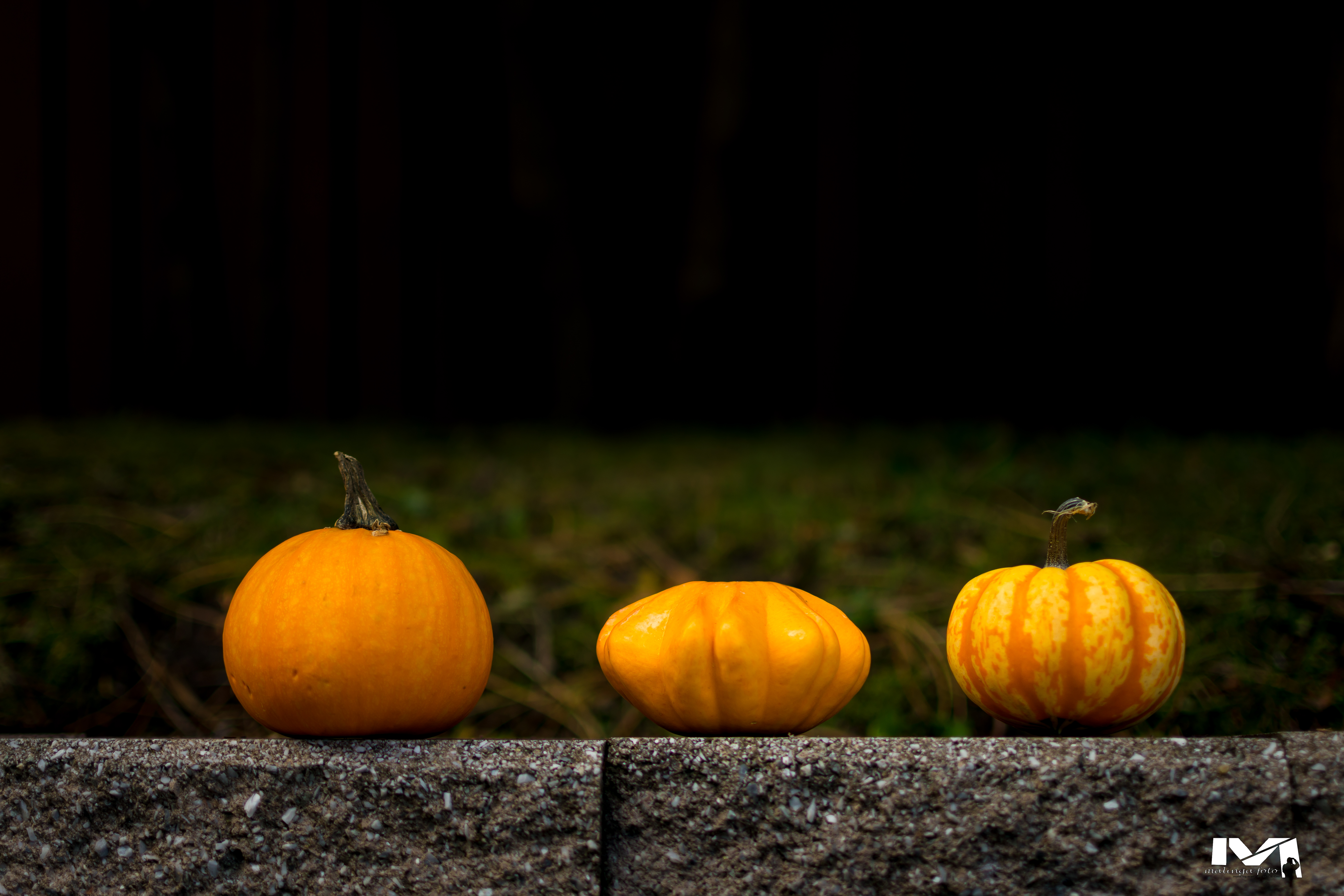
There are many rules and guides to placing elements in a photograph for maximum impact. These photo composition rules are helpful, but remembering them is difficult, let alone applying them when you take your images. Here is some good news. There are only five fundamental photo composition techniques you need to know. If mastered, these five composition techniques will eliminate the need to learn any other photo composition method.
Table of contents

These five fundamental rules are the basis of all other photography composition methods. As such, fully understanding these six foundations of composition will enable you to make powerful and creative images.
Before we get into the five foundations of photo composition, note that these are not rules. Even though some have the word rule, they are just suggestions for good composition. In photography and any artistic endeavour, for that matter, it is encouraged to think outside the box. As such, creative artists break the rules. But to do so, there is a need to understand the “rules” entirely. Here are the six foundations of composition.
1-Put subject off-center (rule of thirds)
One of the foundational photo composition rules is to place the subject off the center of the frame. But why off-center? By placing the subject off-center, we open the picture. The eye is free to wander within the frame, making the image more dynamic. When subjects are placed in the center, the eye gets “stuck” in the center, ignoring the rest of the picture.
Off-centering the subject is what the rule of thirds is all about. This compositional rule states that for a photograph to have an impact, the image’s focal point should be in a specific position within the frame. To determine these points, you make imaginary lines (most cameras now have an option of displaying these lines in the viewfinder) within the scene. The lines divided the scene both horizontally and vertically into thirds. You place your focal point along any of these lines for a dynamic image. Other photographers go as far as to suggest only placing the focal point at the points where the lines intersect for maximum effect.

As you may have noticed, the whole purpose of the rule of thirds is to avoid placing the subject in the middle of the frame. Therefore, the rule of thirds is merely a memory clutch to force the photographer not to put the focus point in the middle of the frame. This rule has many variations, such as the spiral and the golden triangle. Although they divided the frame differently, they all follow the same principle of avoiding placing the subject in the center of the frame.
2-Leading Lines
Leading lines is a photo composition rule where you guide the viewers’ eye to the focal point of your image by utilizing the lines with the image. Leading lines could be anything from a road to a row of trees. The idea here is to guide the viewers’ eyes to the focal point by following the lines.
For example, if photographing a building, you can use the path to the building as your leading line. Depending on how you place the path in the frame, it can guide the eye of the viewer to the focal point -the building. In this case, you can use the rule of thirds in conjunction with leading lines to create a compelling photo. You will place the house in the top third of the frame and use the bottom two-thirds of the image for the path leading to the building. The eye will start from the bottom of the frame, following the path until it rests on the building.

Leading lines is an excellent photo compositional rule which, if utilized, will transform your photography. It guides the viewers’ eyes to the focal point and balances and anchors the image. Without using leading lines, the eye may wander within the image and focus on something else.
3-Remove distracting elements (pole sticking over the head)
This photo composition guide aims to make pictures that are clean and simple. There is nothing off-putting than an image that has a lot going on. Pay attention, particularly to the background, for any distractions that may take away from the picture’s focal point. Ensure there are no distracting or competing elements to the focal point within the frame. Our eyes tend to wander, and if nothing stands out in the picture to capture the eyes’ attention, they will keep roaming.
A picture is like a joke; it needs a clear punch line to capture the reader. An image with clutter (visual distractions) is a joke without a punchline. It is a joke that rumbles on and on without a purpose. The punchline in photography is the chosen focal point, which must stand out clear of any clutter. Clutter in the image weakens the picture and is a visual turnoff. Distractions include light poles coming out of people’s heads or chopped-off elements in the edges of the frame.
There are ways to remove clutter in images. Filling the frame with the subject or using a shallow depth of field (bokeh) can remove distractive elements in the picture. By filling the frame or cropping in tight, the subject will dominate the frame, making it the focal point by default. When using shallow depth of field to throw the background out of focus, make sure that your depth of field is deep enough so you do not blur the subject.

4-Symmetry and pattern
This compositional guide may be confused with guiding lines. While guiding lines direct the eye to the focal point, symmetry and pattern are the focus themselves.
A pattern is any design that repeats itself. Patterns are very pleasing to the human eye. They convey deliberateness, a sense of intention and order, and, most of all, they are visually stimulating.
On the other hand, symmetry is a pattern that has a distinctive characteristic of having two identical sides. This unique characteristic conveys stability and grounds the image. Symmetry can also work as a leading line guiding the eye from the foreground to the focal point.
When taking images, look for and take advantage of symmetry and patterns in the scene. As indicated above, you can make patterns or symmetry the subject of your image or use them to bring life and interest to your focal point.
5-Framing
As the name suggests, framing uses elements in your scene to form a border around the image. Anything can be used as a framing element if it bounds the picture’s focal point. For example, in portraiture, you can sit the subject in front of a window. In this case, the window will frame the subject.

Using frames adds focus to your subject and guides the eye to where you want it to rest within the image. Frames can be in the foreground or the background of the image, and they do not necessarily have to bound the focal point like a picture frame. The point here is to focus the viewers’ eye on the focal point.
photo composition final thought
Photocomposition is the most crucial aspect of photography. How you arrange the elements in the photo will guide the viewer to the focal point and convey the intended message. It is essential to emphasize that these are simply guidelines. Creativity is to be innovative; hence, you should not be bound by these techniques. You may find these techniques limiting or restrictive in your quest to be creative. Don’t be afraid to bend or even break them: photo composition rules are not set in stone.
- The Ultimate Guide to Culling Photos Fast - March 4, 2026
- How to Land Your Dream Photography Job - December 29, 2024
- The Ultimate Photography Portfolio Websites - September 6, 2024


